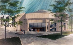
Rumor has it, the Anita Tuvin Schlechter Auditorium (ATS) is named for a trustee who agreed to fund the building if she could design it herself. Schlechter was not an architect. One performance artist grumbled that she wished she had a sledge hammer to break down the ridiculous dividing walls between the upper and lower seating areas. Aesthetically, the auditorium reeks of the 1970s. As a supervisor to many Clarke Forum events in ATS, I often see this landscape as a problem. I will share my observations of a particularly crowded lecture to shed light on some functional and aesthetic problems in the landscape.

Dickinson College Archives
To look beyond symptoms in the problem lens, D.W. Meinig asks the viewer to use “greater awareness of what is happening and why”. He divides design problems (ATS is a failure of design) into function and aesthetic. As a human landscape, the problem arises from how both of these systems amplify behavior.
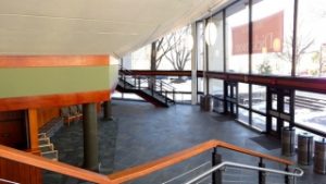
The lobby to ATS is vast – visitors may mill about in confusion as they look for the obscure theater entrances. This is also where the landscape problem begins. Groups arrive in waves. Students pour in as late as possible. The first visitors approach from the right staircase, relative to entering. They quickly fill up the raised seats to their immediate left and bottom right but mostly neglect the spaces past these first sections. The sharp left turn at the top of the stairs disorients visitors and amplifies a couple feedback loops which, in turn, amplify clogging behavior.

Dickinson College
Professors in the first couple rows of the floor level and far-left seating areas require students to sign-in for class. Students waiting to sign-in talk with friends. Groups continue to enter the space from behind them. Stalled and blocked, the new groups fill up the seats to their immediate left even faster. The seating area stairs in ATS are functionally dangerous, mismatched. Flow slows and a crowd backs up on the entry stairs. To avoid danger, project managers orient crowd flow to an alternative stairwell. A similar problem emerges, and the flow alternates again.
Relationships define social spaces. As groups and couples fill the seats, small pockets remain unoccupied. Rather than scramble over human terrain, leaving friends behind, visitors sit against the back wall, along the aisles, or stand. The question and answer section of the event redefines the power relationship of the landscape. Through hostile past experiences, the facilitators must view the potential problem in this landscape. The traditional lenses absorbing the speaker’s answers for knowledge creation are secondary to the nonverbal communication between facilitators and screening of audience members. The platform for airtime is in relatively short supply so its moderation is very important.
The aesthetics and function of ATS amplify behavior which clogs flow. This landscape through the lens of a problem demonstrates the amplifying effects of design on behavior. Other useful lenses could be history, aesthetic, system, or artifact. From the role of a supervisor, this horribly designed landscape is a problem.
